
The new Home Assistant dashboard card picker fixes a problem that sounds small until you watch a beginner build their first dashboard.
They usually know exactly what they want. A light on the dashboard. A thermostat. A speaker. Maybe a sensor that shows the living room temperature. Then Home Assistant asks the old question: which card type do you want?
And that is where the little panic starts.
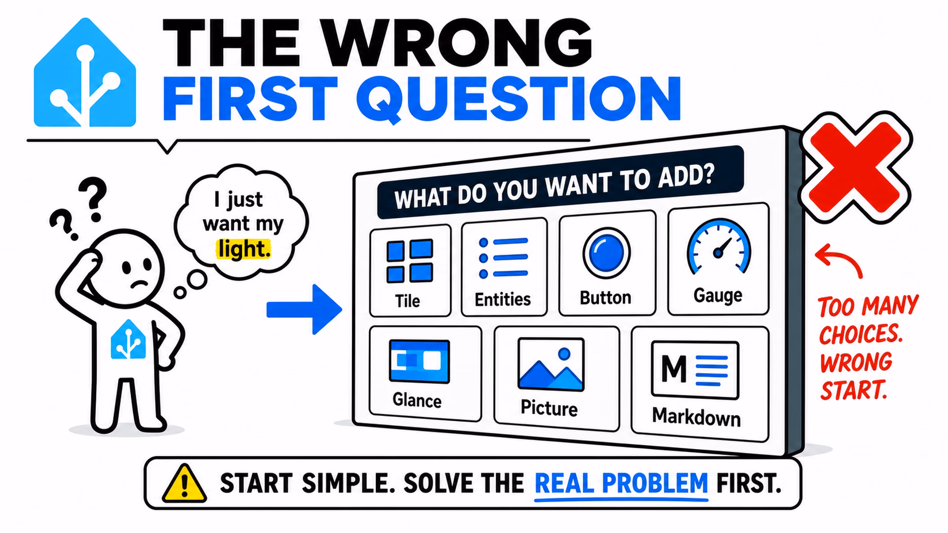
Tile? Entities? Button? Gauge? Glance? Picture? Markdown? If you already live inside Home Assistant every day, those names are normal. If you are new, they sound like someone handed you a box of parts and said, “Good luck, dashboard engineer.”
This is why the new Home Assistant dashboard card picker in Home Assistant 2026.6 matters. It changes the first question. Instead of starting with the card type, it starts with the thing you want to control or show.
Table of Contents
The old problem was the first question
The old Add card dialog was not useless. It worked well if you already knew the difference between the common Home Assistant cards. The problem was timing.
A beginner does not usually think, “I need an entities card.” A beginner thinks, “I want my kitchen light here.” Or, “I want to see if the garage door is open.” Or, “I want music controls on this page.”
Those are real home questions. Card types are Home Assistant vocabulary. There is nothing wrong with that vocabulary, but it should not be the first wall a new user hits.
That is the part I like about this update. The new Home Assistant dashboard card picker does not pretend dashboards are suddenly magic. It simply starts closer to how people think.
The new flow starts with the entity
In Home Assistant 2026.6 and onwards, adding a card opens on a new By entity tab. On the left side, you see your home as a tree: floors, areas, devices, entities, and an Unassigned section for things that do not belong neatly anywhere else.
That already feels more natural. You can browse the home first, then choose the thing. If you know the name, search can jump straight to a flat result list.
Once you pick an entity, the right side fills with card previews that fit that entity. This is the useful bit. Pick a light and you can see light-friendly options. Pick a cover and you can see open, close, position, or tilt-style controls. Pick a media player and you can get playback or volume controls. Pick a numeric sensor and a trend graph tile may make more sense than a plain number.
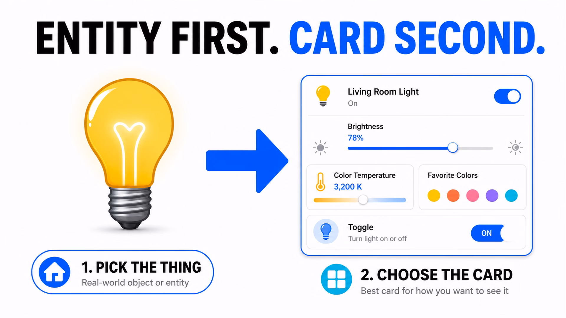
That is the whole mental shift: entity first, card second. The Home Assistant dashboard card picker now feels less like choosing from a parts catalog and more like saying, “I want this thing on my dashboard. What are the sensible ways to show it?”
Live previews remove a lot of guessing
The other big improvement is the preview. The suggestions are not just names in a list. They render as real previews of how the card will look with your data before you choose it.
That matters because dashboard building often turns into this silly loop:
- Add a card.
- Look at it.
- Realize it is not the thing you imagined.
- Delete it.
- Try again.
That loop is annoying for experienced users. For beginners it is worse, because every failed attempt feels like they misunderstood Home Assistant. Sometimes they did not. They just had to guess from names that were not obvious yet.
The new Home Assistant dashboard card picker makes the choice more visual. A beginner can compare what the card will actually do. A power user can also move faster, because the answer is visible before clicking Add.
If the words still feel confusing
There is still some Home Assistant language in this topic. Entity. Device. Area. Integration. Card. Tile. These words become normal after a while, but at the beginning they can feel like a tiny smart home exam nobody warned you about.
If you want a simple helper for that, I made a Home Assistant glossary PDF. It is packed with Home Assistant words, acronyms, and their simple, useful explanations.
To get the PDF, type your name and e-mail. You will receive an e-mail from me to confirm you are not a robot, and the PDF will be sent to your inbox. You’ll also be subscribed to my newsletter where I share new content, updates, and my exclusive AI and HA challenge. It’s free and you can unsubscribe anytime with one click.
Now back to dashboards, because the best part of this change is what Home Assistant did not remove.
Tired of reading?
I also made a video version of this explanation. You can watch it here: Home Assistant dashboard card picker video.
The video shows the same idea in a more visual way, which fits this topic nicely because, well, we are talking about dashboards. Reading about a card picker is useful. Seeing it is better.
The old By card tab is still there
This part is important. The update does not punish experienced users. The familiar By card tab is still available.
That is the right decision. Home Assistant is powerful because it gives control. Hiding the advanced path would make some people faster for one week and annoyed forever after that. Nobody wants their smart home dashboard to become a children’s menu.
The better approach is a ramp. Beginners get a guided start through the Home Assistant dashboard card picker. Advanced users can still go straight to the full card list when they know exactly what they want.
On mobile, the same idea becomes a two-step flow. First you choose the entity, then you choose the card. That makes sense because a phone screen does not have enough room for a big side-by-side picker.
Why this matters more than it sounds
The official Home Assistant 2026.6 release notes describe this as the first visible step in a broader effort to make dashboard building feel more natural. That is the part I keep coming back to.
Home Assistant is not hard only because of technical setup. Often the hard part is the first moment where the system asks a question using words you do not use yet.
A new user says, “I want to control my blinds.” Home Assistant says, “Which card type?” That gap is small for experienced users and huge for beginners.
The new Home Assistant dashboard card picker narrows that gap. It lets the user stay in normal home language for longer: light, cover, speaker, temperature, calendar, to-do list. Then Home Assistant suggests the dashboard options that fit.
This is also why I think the change is useful even if you already know dashboards well. Many of us help friends, family, clients, or people in the community. A cleaner first dashboard experience saves a lot of explaining.
What I would try first
If you are new to Home Assistant dashboards, I would test the new picker with one simple room. Do not start by redesigning your whole house. That is how a “quick dashboard tweak” becomes a three-hour archaeology project with snacks.
Pick one area, maybe the living room. Add one light, one sensor, and one media player if you have them. Use the Home Assistant dashboard card picker to choose cards from the entity previews, not from memory.
- Open the dashboard editor.
- Click Add card.
- Stay on By entity.
- Choose the room, device, or entity.
- Compare the previews.
- Pick the card that matches the job.
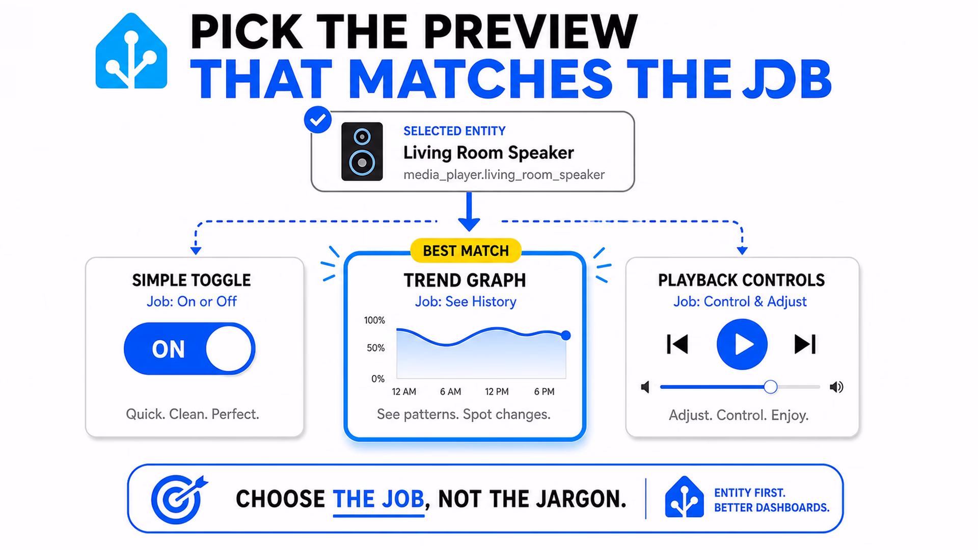
For a lamp, a simple toggle may be enough. For a dimmable light, brightness controls may matter. For a sensor, a graph may be more useful than a plain number. For a speaker, playback controls may be better than only showing the speaker name.
That is the point. The picker helps you think about the job first. The card type becomes the answer, not the starting problem.
The simple takeaway
The new Home Assistant dashboard card picker is not a flashy feature in the usual way. It will not make your lights brighter. It will not fix the fact that you still have one mysterious entity called sensor.living_room_2 that nobody wants to rename. We all have one of those.
But it fixes a real beginner problem. It starts with the thing in your home, then suggests the card. That is a better first step.
And for Home Assistant, better first steps matter. The easier the first dashboard feels, the more likely a new user is to keep going, learn the vocabulary, and eventually become the person who argues about dashboard layouts at midnight. A natural lifecycle, sadly.
If you want more
If you want more simple Home Assistant explanations, check my Home Assistant articles. You can also browse more Home Assistant dashboard posts if dashboards are your current rabbit hole.
And if the Home Assistant words still feel messy, grab the Home Assistant glossary PDF. It will not build the dashboard for you, but it will make the buttons and labels feel much less like secret club language.